
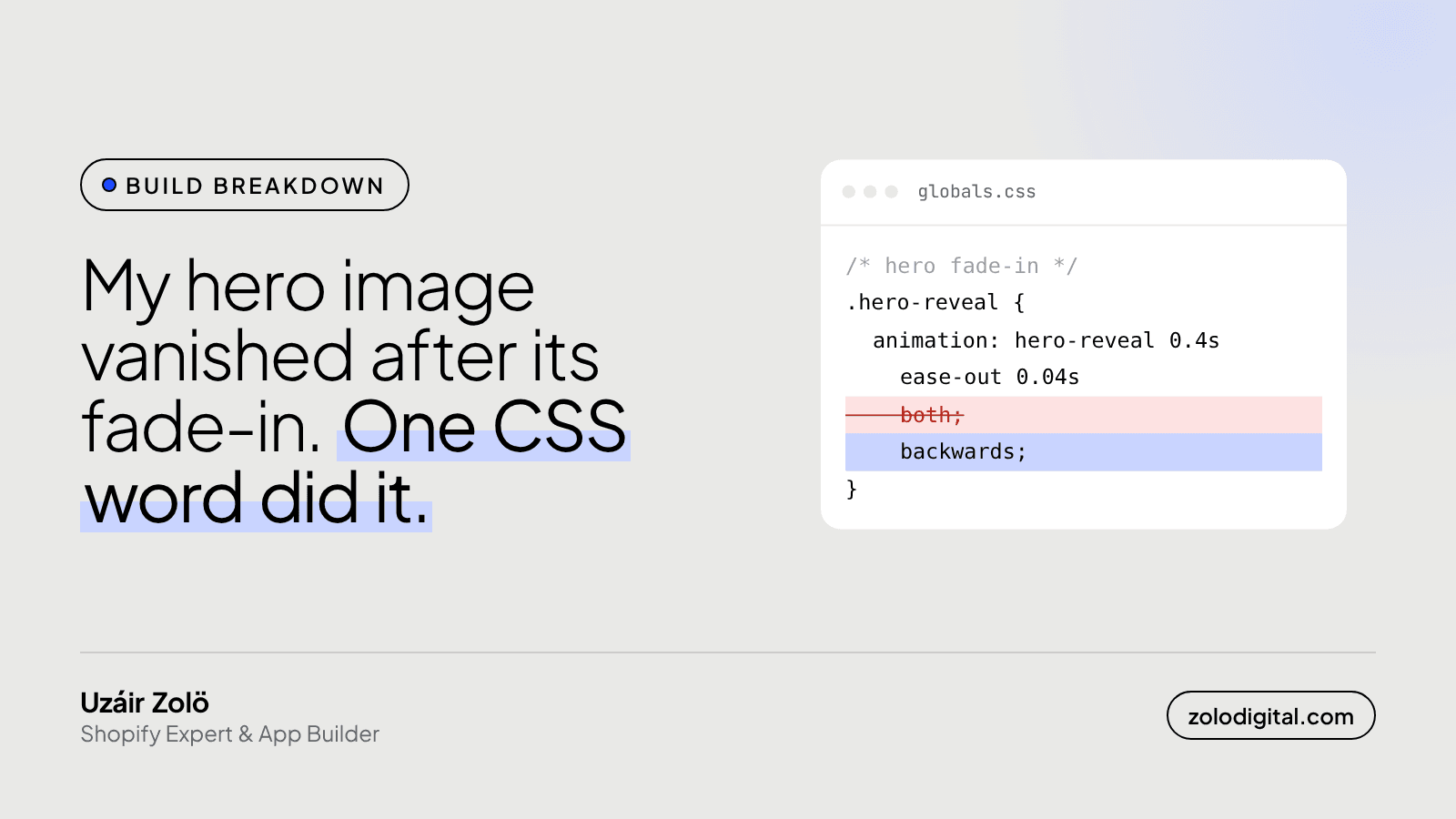
If your hero image vanishes once its fade-in animation ends, look at animation-fill-mode. With both, the last keyframe stays applied forever, and if that frame includes a filter (even blur(0)), Chromium can fail to paint a large image. Switch to backwards, so the start frame covers the delay and nothing lingers after.
I found this on my own site, which is a nice place to find it. Nobody to apologise to except the mirror.
What actually happened?
While rebuilding zolodigital.com, the hero portrait got a short entrance: a little blur, a six-pixel slide, opacity up to 1. It looked good for exactly as long as it was animating.
Then, in Chrome, the photo was gone. The box it lived in was the right size. The page around it was fine. The portrait itself just didn't paint.
The animation looked like this:
@keyframes hero-reveal {
  from { opacity: 0; transform: translateY(-6px); filter: blur(6px); }
  to   { opacity: 1; transform: translateY(0);    filter: blur(0); }
}

.hero-reveal {
  animation: hero-reveal 0.4s ease-out 0.04s both;
}
Why does fill-mode: both cause it?
both means two things: apply the first keyframe during the delay (that's backwards), and keep the last keyframe applied after the animation ends (that's forwards).
The second half is the trap. After the fade, the element still has filter: blur(0) sitting on it. On paper that's a no-op. In practice a filter changes how the browser composites the element, and on a large object-contain image Chromium stopped painting it at all.
How do you fix a hero image that disappears after animating?
Three small changes did it on my site:
@keyframes hero-reveal {
  from { opacity: 0.01; transform: translateY(-6px); filter: blur(6px); }
  to   { opacity: 1;    transform: translateY(0);    filter: blur(0); }
}

.hero-reveal {
  animation: hero-reveal 0.4s ease-out 0.04s backwards;
}

.hero-reveal-delayed {
  animation: hero-reveal 0.4s ease-out 0.14s backwards;
  will-change: opacity, transform, filter;
}
backwardsinstead ofboth. The start frame still covers the delay, so there's no flash, and once the animation ends the element goes back to its normal styles. No leftover filter.- Start at
opacity: 0.01, not0. An element at exactly opacity 0 isn't a candidate for Largest Contentful Paint, so the browser only counted the hero once the fade was under way. At 0.01 it's invisible to people and visible to the metric from the first paint. will-changeon the one wrapper that still flickered. The later-starting wrapper sometimes failed to repaint when its filter animation ended, even withbackwards.will-changekeeps it on a stable layer for the whole time.
Does this matter for a Shopify store?
Yes, if your hero, banner or first product image fades in. That fade can come from the theme's "reveal on scroll" setting, from an app, or from custom CSS someone added for a launch. Two things to check:
- Open the homepage in Chrome on a real phone and wait past the animation. If the image is there, then gone, or flickers, check the fill-mode.
- Search the theme's CSS for
bothandforwardson animations that touch images above the fold. If the final frame has afilter, switch it tobackwards, or drop the filter from the animation.
And if the fade starts from opacity: 0, your Largest Contentful Paint is being measured from the middle of the animation, not from when the image arrived. That's a slower score for something nobody can see.
Is a fade-in worth keeping at all?
A short one is fine. Keep it under half a second, keep it off anything a shopper needs to read straight away, and make sure the page works if the animation never runs. Pretty is allowed. Invisible is not.
If your homepage feels slow or jumpy and you'd like someone to find the one word causing it, that's what my Shopify speed work is for. Or send me the store and I'll take a look.


