
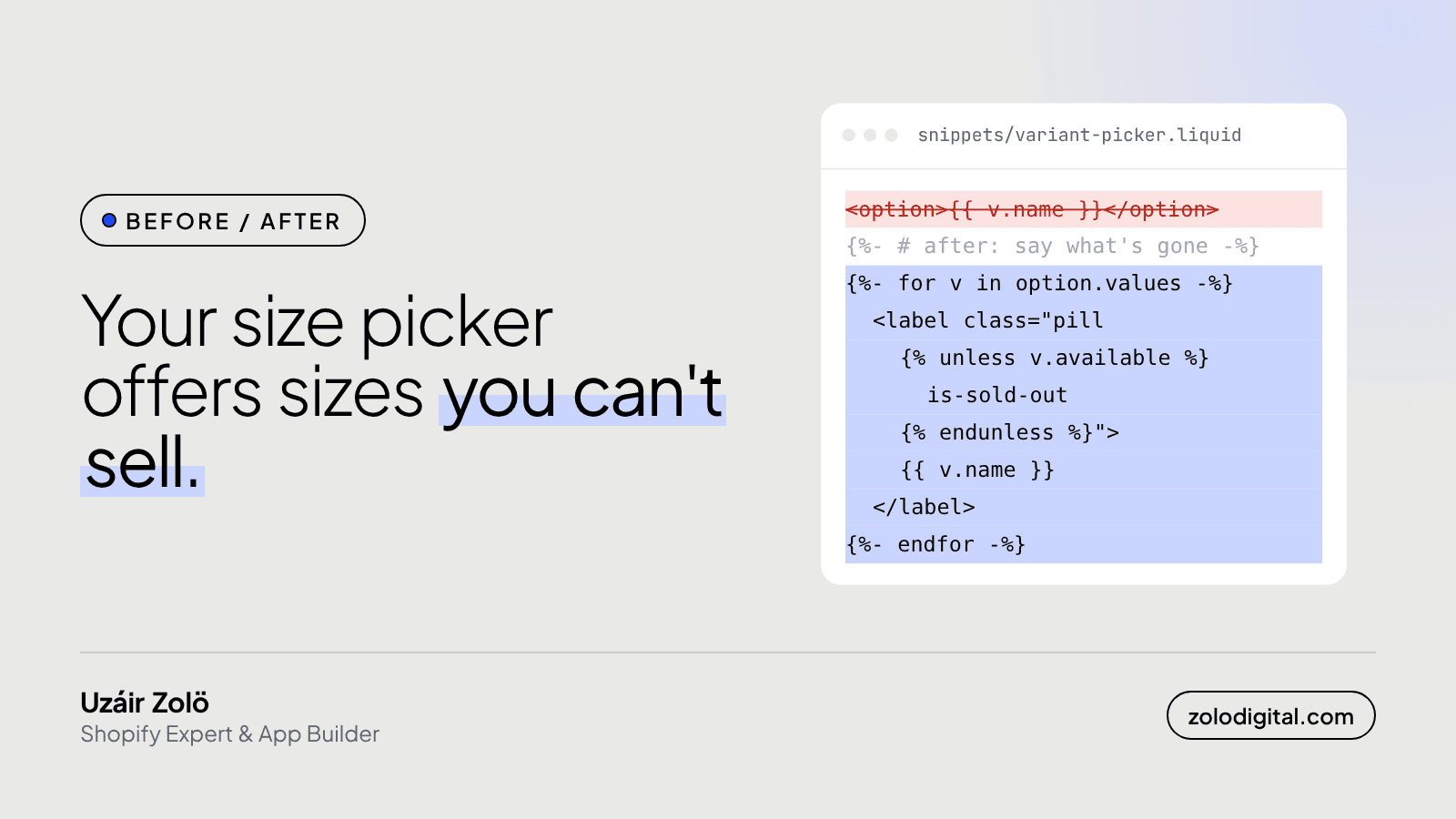
Show sold-out sizes in the picker, crossed out and faded, and keep them selectable. Don't make them look like every other size, and don't hide them. In Liquid, each option value has an available property that is false when no variant with that value can be bought, so one unless adds a class you can style.
Some product pages play a game called "pick a size and find out". You choose Medium, the button turns into Sold out, you try Large, same again. The shopper ends up doing your stock check, one tap at a time, and most of them stop playing before you'd like.
What goes wrong with a plain size picker?
The old pattern lists every value of an option as equal: a dropdown of names, or a row of identical buttons. Stock only shows up after a choice, on the Add to cart button. That causes three problems:
- Wasted taps. Every sold-out size costs the shopper a tap and a small disappointment.
- A button that changes under the thumb. On a phone, the shopper is looking at the sizes, not at the button below them, so "Sold out" is easy to miss and the next tap does nothing.
- Two options make it worse. With size and colour, Medium might be in stock in Black and gone in Red. A flat list can't tell you that.
How do you mark sold-out sizes in Liquid?
Recent versions of Shopify's Dawn theme already mark unavailable values, so if you're on a current version, check yours before changing anything. Older and heavily customised themes often loop over plain option names. The fix is to loop over the option's values as objects and read available:
{%- for option in product.options_with_values -%}
  <fieldset class="variant-option">
    <legend>{{ option.name }}</legend>
    {%- for value in option.values -%}
      <label class="pill{% unless value.available %} is-sold-out{% endunless %}">
        <input
          type="radio"
          name="{{ option.name | handle }}"
          value="{{ value.name | escape }}"
          {% if value.selected %}checked{% endif %}
        >
        {{ value.name }}
        {%- unless value.available -%}
          <span class="visually-hidden"> (sold out)</span>
        {%- endunless -%}
      </label>
    {%- endfor -%}
  </fieldset>
{%- endfor -%}
value.available takes the shopper's other choices into account: with Red selected, it tells you whether Red in that size can be bought. The visually hidden text says "sold out" to screen readers, which can't see a strikethrough.
Then the styling:
.pill.is-sold-out {
  opacity: 0.5;
  text-decoration: line-through;
}
Why keep sold-out sizes selectable?
Because the shopper who wants Medium is the one most likely to sign up for a back-in-stock alert or ask when it returns. If the size can't be selected, they never reach that form. Let them pick it, show Sold out on the button, and put the alert or a "message us" link right there.
Should you hide sold-out sizes instead?
I wouldn't. A missing Medium reads as "this brand doesn't make Medium", and that shopper leaves for good. A crossed-out Medium says "they make it, it's gone for now", which is a reason to come back. Hiding values also confuses shoppers when a colour's size list keeps changing length as they click around.
The exception is a variant that will never return, like a discontinued colour. Remove that variant from the product rather than hiding it in the theme.
What about stores with two or three options?
The picker has to refresh when another option changes, or the crossed-out sizes will describe the colour the shopper had selected before. Dawn does this by re-rendering the section when a choice changes. If your theme only swaps the price and image in JavaScript, the picker needs the same treatment. Test it on a phone: pick a colour, check the sizes, pick another colour, check again.
The short version
Cross sold-out sizes out, keep them tappable, put a back-in-stock option where the Add to cart button would be, and test every colour. It's a small change on the product page, which is where small changes do the most work.
If your product page needs a look from someone who has built a lot of them, here's my Shopify UX and UI design service.


