
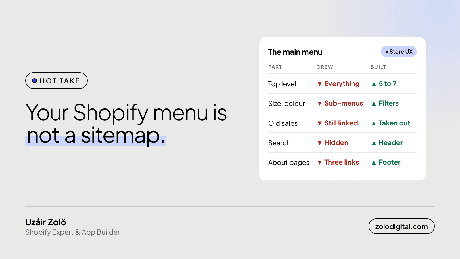
A Shopify main menu works best with about five to seven top-level links, named the way shoppers talk, that get someone to products in two taps. Sizes, colours and prices belong in collection filters, not sub-menus. Old campaign collections come out of the menu, search stays where a thumb can reach it, and the "about" pages move to the footer.
Some Shopify menus aren't menus. They're the whole sitemap wearing a hat. Open one on a phone, tap the hamburger, and you get every collection the store has ever made, including the one for a campaign that ended two summers ago.
Nobody designs a menu like that. It grows. Every new collection gets a link, and nobody is ever in charge of taking one out.
Why does a long menu hurt a Shopify store?
Because the menu's job is to get a shopper to products, not to prove the catalogue exists. Every extra link is one more thing to read before they tap, and on a phone they read it one cramped line at a time.
The usual symptoms:
- The same thing three ways. Tops, Tops (Sale), Tops (New). The shopper has to work out which one has the thing they want.
- Warehouse names. "SS-Core", "Range B", "Misc". They make sense to the team that named them.
- Dead campaigns. A link to a sale that's over, landing on a collection with three sold-out products.
- "About Us", "Our Story" and "Who We Are". Three links, one page.
How many top-level links should the menu have?
Five to seven is a good ceiling. Enough to cover what the store sells, few enough to read in one glance. If you need more, the categories are probably too thin, or some of them are really filters in disguise.
Name them the way a shopper would say them out loud. "Dresses", not "Women's Apparel – Dresses Category".
Shopify menus can nest up to three levels deep (edit them under Content → Menus in the admin; older admins call it Online Store → Navigation). That's a limit, not a target. Two levels is plenty for most stores.
Should sizes and colours be in the menu?
No. That's what filters are for. "Tops → Black", "Tops → Size M" and "Tops → Under 2,000" are three sub-menus doing a filter's job, badly.
Shopify's free Search & Discovery app adds filters to collection pages: availability, price, product type, vendor, variant options like size and colour, and metafields. One "Tops" link plus good filters beats a dozen sub-menus, and it can't go stale when a new colour arrives.
What should happen to old campaign collections?
Take them out of the menu. Removing a menu item doesn't delete the collection, so the page and its URL keep working for anyone who bookmarked it or found it in Google.
If you do delete a collection or change its handle, add a URL redirect so old links land somewhere useful. I wrote up how in what happens when you change a Shopify URL handle.
Where should search and the "about" pages go?
Search goes where a thumb can reach it. On a phone, a search icon tucked inside the menu drawer is a search box most shoppers never find. Most themes let you show it in the header.
"Our Story", shipping, returns and contact go in the footer menu. People look for them there, and they stop pushing products down the main menu.
How do you test a Shopify menu?
The boring way works best. Ask someone who has never seen the store to find one specific product on their phone. Watch. Don't help.
Where they hesitate is where the menu is wrong. Where they give up and use search, the menu didn't have a path at all.
The short version
A menu isn't a list of everything you sell. It's the fastest route to the thing someone came for. Cut it to the routes people actually take, let filters handle the rest, and take one link out every time you add one.
If you'd like a second pair of eyes on yours, I look at navigation as part of Shopify UX and UI design and in the Shopify store audit.


