
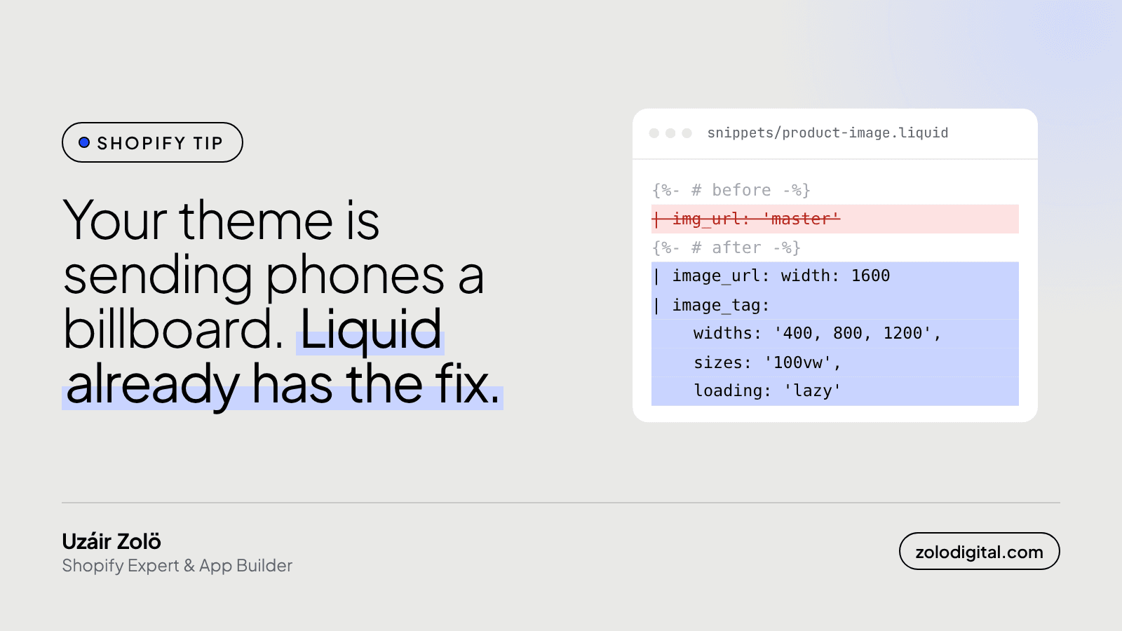
Your Shopify store sends full-size images to phones when the theme asks for the original file, usually with img_url: 'master', and lets the browser shrink it. The fix is in Liquid: request a capped width with image_url, let image_tag write a srcset, add sizes, and lazy load everything below the fold except the hero.
In other words, your store is sending a billboard to a phone so it can show a thumbnail. Shopify isn't being careless here. It's being obliging: the theme asked for the biggest one you've got, so that's what it sends.
Where does the oversized image come from?
You upload product photos big, which is right: Shopify's CDN can resize them on request. The problem is a theme that never makes the request. This pattern is still common in older themes and in snippets copied from old tutorials:
<img src="{{ product.featured_image | img_url: 'master' }}" alt="{{ product.title }}">
img_url is Shopify's older, deprecated image filter, and 'master' means the original file. One URL, one size, for every screen. A phone showing the photo at 400px wide downloads the same file as a 27-inch monitor, then throws most of it away.
How do you serve the right size in Liquid?
Use image_url with a width, then image_tag:
{{ product.featured_image
  | image_url: width: 1600
  | image_tag:
      widths: '400, 800, 1200, 1600',
      sizes: '(min-width: 990px) 50vw, 100vw',
      loading: 'lazy',
      alt: product.title }}
What each part does:
image_url: width: 1600sets a ceiling. Big enough for a desktop product page, nowhere near the original.image_tagwrites the whole<img>for you, including asrcsetthat lists the image at several widths.widthslets you choose which ones; leave it out and Shopify picks a set for you, up to the width you asked for.sizestells the browser how wide the image actually shows on the page. Here: half the screen on desktop, full width below 990px. Without it the browser assumes the image fills the whole screen and often picks a bigger file than it needs.loading: 'lazy'makes images below the fold wait until the shopper scrolls near them.
Should the hero image be lazy loaded too?
No. The hero, or the first product image on a product page, is usually the biggest thing on screen when the page opens, which makes it the image speed tools time you on. Lazy loading it makes the browser wait before fetching the one image you want first. Leave it eager and give it a priority hint instead:
{{ section.settings.image
  | image_url: width: 2400
  | image_tag:
      sizes: '100vw',
      loading: 'eager',
      fetchpriority: 'high' }}
image_tag passes extra attributes like fetchpriority straight through to the <img>.
How do you check your own theme?
- Duplicate your live theme and work on the copy.
- Search the code (Online Store → Themes → Edit code) for
img_url: 'master', and forimg_urlin general. Each hit is a place worth checking. - Open a product page on your phone's screen size in Chrome DevTools, then hover an image in the Elements panel. If the intrinsic size is far larger than the rendered size, that image is oversized.
- Run Lighthouse. "Properly size images" lists the files and how much they could shrink.
- Fix the template, not each image. One change to a snippet like
product-card.liquidfixes every card that uses it.
Modern Shopify themes like Dawn already do most of this. It's the older themes, and the custom sections someone added to them, where 'master' tends to hide. While you're in there, the same search often turns up loops that do too much work and the reasons behind slow collection pages.
Is it worth fixing?
It's one of the cheaper speed fixes going: no app, no new theme, and the photos still look exactly as sharp. Search your theme for 'master' tonight, then decide how you feel about it. If you'd rather hand it over, Shopify store speed work starts with exactly this kind of search, or get in touch and I'll take a look.