
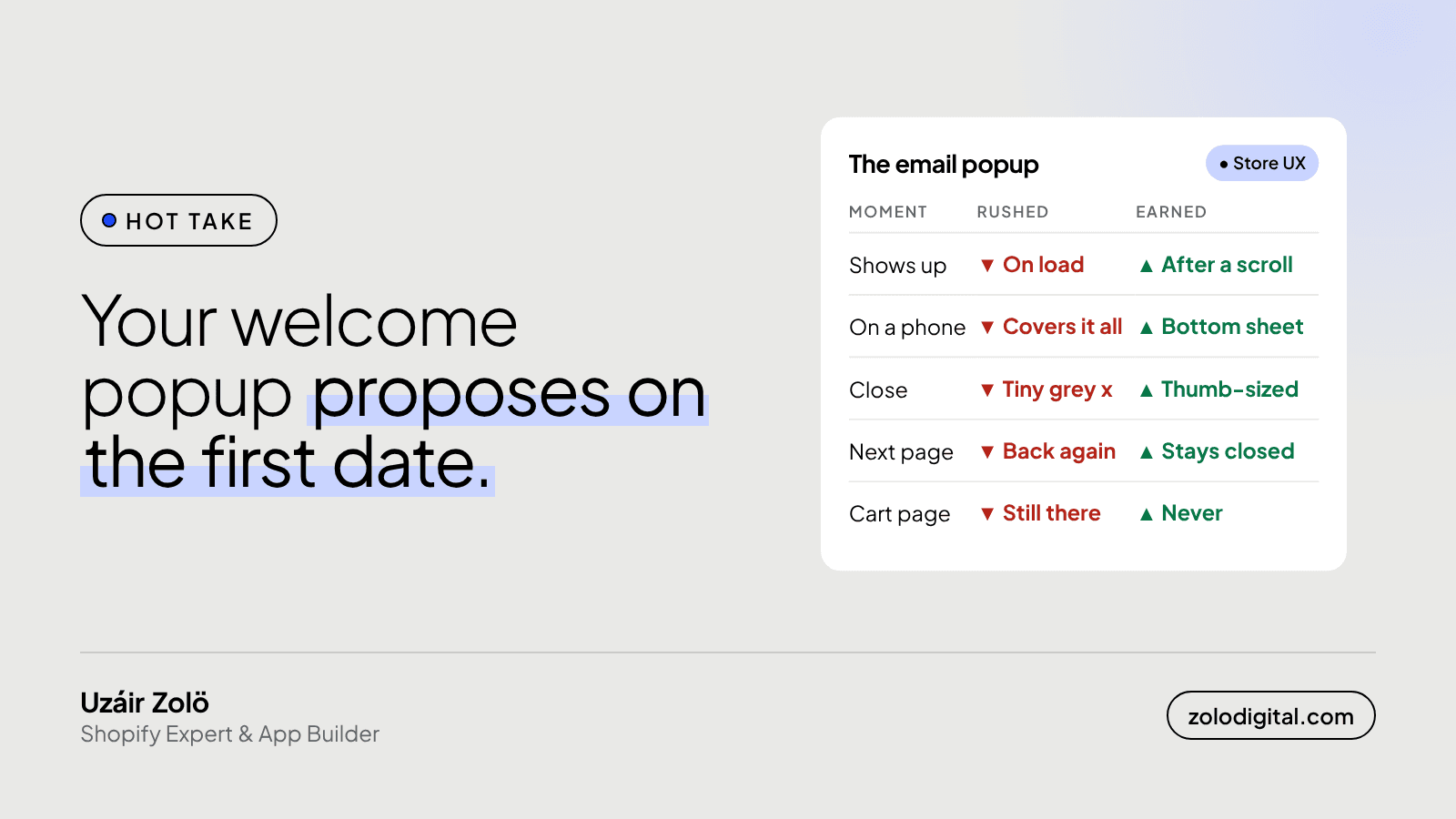
A Shopify email popup should show up after a shopper has shown some interest, not the moment the page loads. Wait for a scroll or a second page view, keep it small on phones, give it a close button a thumb can hit, remember when someone closes it, and keep it off the cart page. Email signups are worth having. Asking before you've earned it isn't.
Most welcome popups propose on the first date. You land on the homepage and, before you've seen a single product, a box covers the screen and asks for your email in exchange for a discount on something you haven't met yet. That isn't a signup strategy. It's a reflex.
Why is a popup on page load a problem?
Because the shopper hasn't decided anything yet. They came to look. The first thing the store does is block the view and ask for a favour. Some sign up. A lot close it without reading, and the ones on a phone have to find the close button first.
It also gets in the way of the page doing its job. The banner, the product, the reason they clicked the ad: all of it sits behind a box. And Google's own guidance on page experience calls out pop-ups that cover the main content on mobile as something to avoid.
What goes wrong on phones?
Most of the problems are mobile ones, which is awkward, because popups usually get approved on a laptop.
- It fills the screen. On a desktop it's a box in the middle. On a phone it's the whole page.
- The close button is tiny. A small grey x in the top corner, which is exactly where thumbs don't go.
- It comes back. Close it, open a product, and there it is again, like it didn't hear you.
Open your own store on your phone, in a private tab so it treats you as a new visitor, and count how long it takes to see a product.
When should the popup actually show?
When the visitor has done something that says they're interested. Most popup apps (Klaviyo, Privy, Omnisend and the like) let you choose the trigger instead of "show immediately". The ones I use:
- After a scroll. Someone who has scrolled halfway down a page is reading, not bouncing.
- On the second page view. They've clicked into something. Now the offer has context.
- On exit intent, on desktop. The mouse heads for the tab bar; that's a fair moment to ask.
Pick one. Stacking a timer, a scroll trigger and an exit popup just means three interruptions.
How should it look on mobile?
Smaller than you think. A slim bar at the bottom or a bottom sheet that covers part of the screen, not all of it. The page should still be visible behind it, so the shopper knows they can get back to what they were doing.
Then the close button. Make it big, high contrast, and somewhere a thumb reaches. A "No thanks" text link under the form works too. If someone is hunting for the way out, you've already lost the signup.
Should it show again after someone closes it?
No. Once closed, it should stay closed for that visitor for a good while. Most apps have a setting for how long to wait before showing it again; use it. Someone who said no on Tuesday doesn't need to be asked again on every page until Friday.
And people who already signed up shouldn't see it at all. If the popup tool knows who your subscribers are, exclude them.
Where should a popup never appear?
On the cart page. Someone with products in their cart is already buying. Let them.
If the popup is built into your theme rather than an app, you can keep it off the cart in Liquid. Snippet names vary by theme, but the idea is:
{%- unless template.name == 'cart' -%}
  {% render 'newsletter-popup' %}
{%- endunless -%}
Same goes for landing pages you send paid traffic to. You paid for that click; let it see the page.
So, popup or no popup?
Popup. Just a polite one. Ask after a little interest, keep it small on a phone, make it easy to say no, and take no for an answer. Most of the settings for that are already in the app you have.
If you'd like a second pair of eyes on your store, popup and everything after it, I record a free teardown of a few stores each week: the top three leaks and one quick win. For a full review of the shopping experience, see Shopify UX and UI design.


