
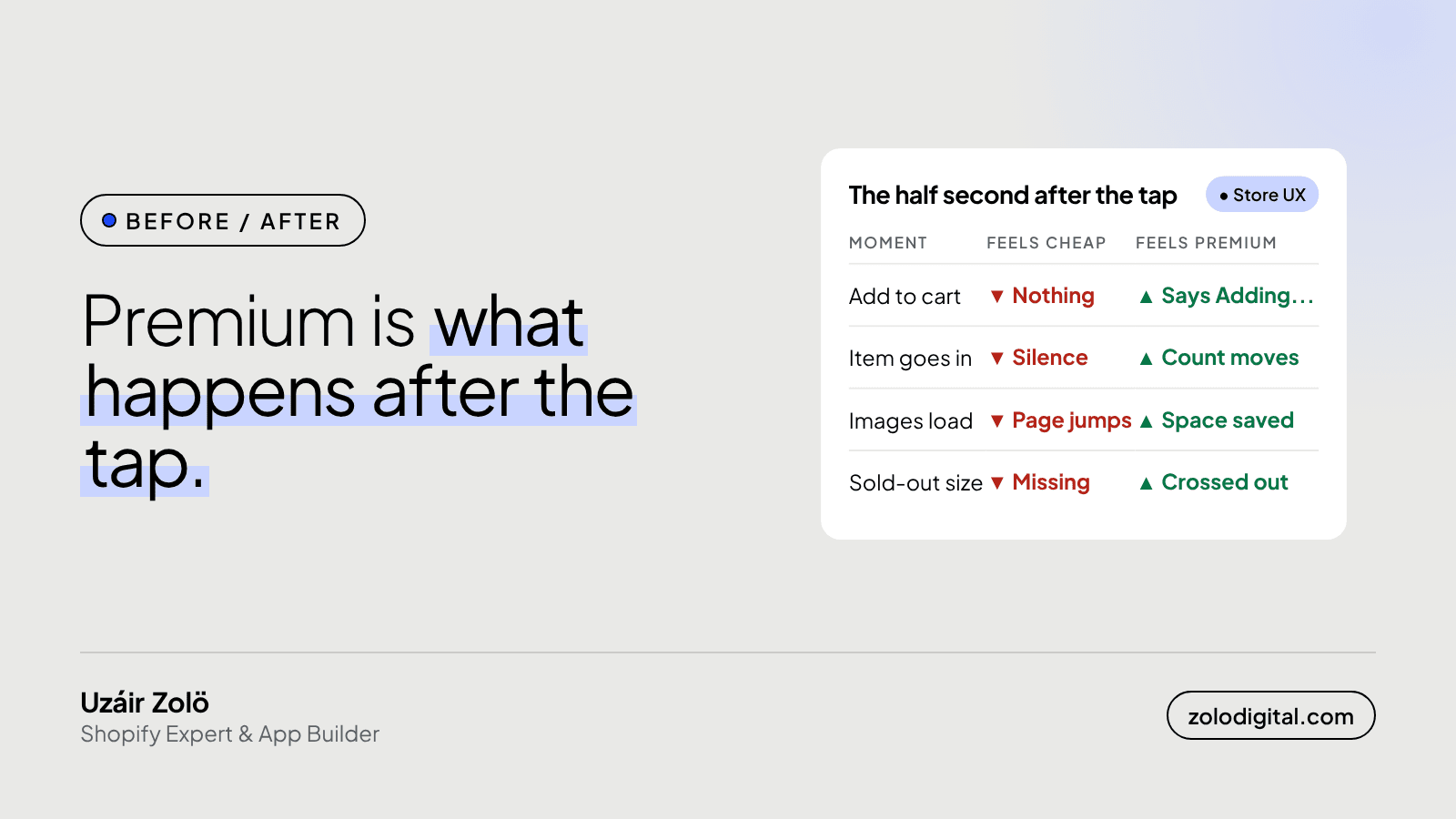
A Shopify store feels premium because of what happens in the half second after a shopper taps something, not because of the homepage banner. The Add to cart button answers straight away, the cart count moves, the page doesn't jump while images load, form errors say what to fix, and sold-out sizes stay visible. Each one is small. Together they decide how the store feels.
My favourite client review doesn't mention a single section of the design. Saim at VERSUS wrote: "Uzáir paid attention to the small interactions that make the whole experience feel premium." That was conversion work on a store that now dispatches about 300 orders a day. I can't tell you which button did what. I can tell you what I look at.
Why do small interactions matter so much?
Because shoppers don't see your design system. They see whether the thing they just tapped did something. A button that sits there silent for a second gets tapped again, and again. A page that jumps moves the button away from the thumb that was about to press it. None of this shows up in a screenshot, and all of it shows up on a phone with one bar of signal.
Two stores can run the same theme and feel completely different. This is usually why.
How should the Add to cart button respond?
Immediately, and in words. Newer themes like Dawn already show a loading state; plenty of older or heavily patched themes don't. If yours doesn't, this is the idea:
form.addEventListener('submit', async (event) => {
  event.preventDefault();
  const button = form.querySelector('[type="submit"]');
  const label = button.textContent;
  button.disabled = true;
  button.setAttribute('aria-busy', 'true');
  button.textContent = 'Adding...';
  try {
    const res = await fetch('/cart/add.js', { method: 'POST', body: new FormData(form) });
    if (!res.ok) throw new Error('add failed');
    const cart = await (await fetch('/cart.js')).json();
    document.querySelectorAll('[data-cart-count]')
      .forEach((el) => { el.textContent = cart.item_count; });
  } catch {
    button.textContent = 'Try again';
    return;
  } finally {
    button.disabled = false;
    button.removeAttribute('aria-busy');
  }
  button.textContent = label;
});
Two interactions in one: the button says what it's doing, and the cart count moves when the item goes in, so nobody has to open the cart to check.
How do you make buttons feel pressed?
One rule of CSS. A tiny press tells the thumb it worked:
.button:active { transform: scale(0.97); }

@media (prefers-reduced-motion: reduce) {
  .button:active { transform: none; }
}
Keep it subtle. If people notice the animation, it's too much.
How do you stop the page jumping while images load?
Give every image its size before it arrives. Shopify's image_tag filter adds the image's width and height for you, so the browser saves the space:
{{ product.featured_image | image_url: width: 800 | image_tag: loading: 'lazy' }}
The usual culprits are hand-written <img> tags without width and height, and banners sized by their content. Fix those and the Add to cart button stays where the thumb expects it.
What about form errors and sold-out sizes?
Errors should say what to fix, next to the field, in plain words. "Enter a phone number with the area code" beats a red outline and a prayer.
Sold-out sizes should stay on the page, crossed out, instead of disappearing. A missing size looks like a broken page; a crossed-out one looks like a busy store. In current Liquid each option value knows whether it's available:
{%- for value in option.values -%}
  <label class="swatch{% unless value.available %} is-sold-out{% endunless %}">
    <input type="radio" name="{{ option.name | escape }}" value="{{ value | escape }}">
    {{ value }}
  </label>
{%- endfor -%}
Then .is-sold-out { text-decoration: line-through; opacity: 0.5; } does the rest.
The short version
Answer every tap, move the cart count, press the button, save the image space, explain the error, keep sold-out sizes visible. None of it will get a round of applause in a design review. Your customers will just feel it, which is the point.
If your store looks right in screenshots but feels off on a phone, that's the kind of Shopify UX work I do. You can also read the VERSUS case study.


